Category:
Internal Tool
Created For:
Concept Project
In the world of game development, building a team often feels like assembling a raid party—animators, technical artists, designers, VFX specialists, engineers… Everyone brings different strengths to the table.
But that’s where the challenge begins:
How do you quickly find the right person for the job? How do you know who’s good at what? And how do you get a clear picture of your team’s capabilities without digging through spreadsheets or endless org charts?
That’s the problem I wanted to explore.
Virtuos—a global game development partner behind titles like Cyberpunk 2077, The Last of Us, and Red Dead Redemption 2—represents the scale and complexity of this challenge perfectly. Though this is a self-initiated project and has not been implemented, it's grounded in real-world production needs.
Problem to Solve
This internal system was designed to help large studios like Virtuos:
Quickly match team members to project requirements
Evaluate the skill structure of entire teams at a glance
Replace scattered tools and static spreadsheets with a centralized, visual platform
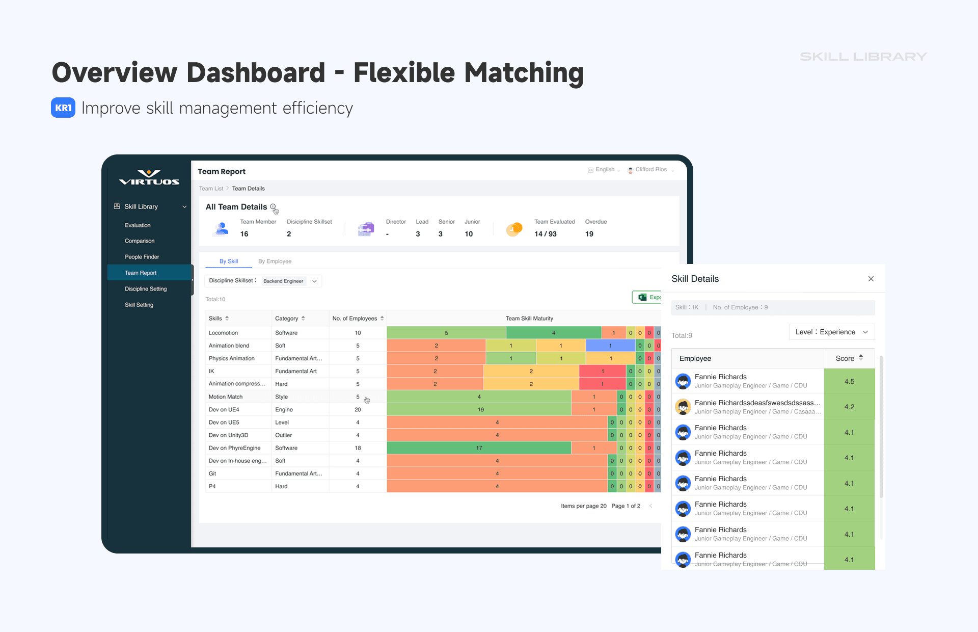
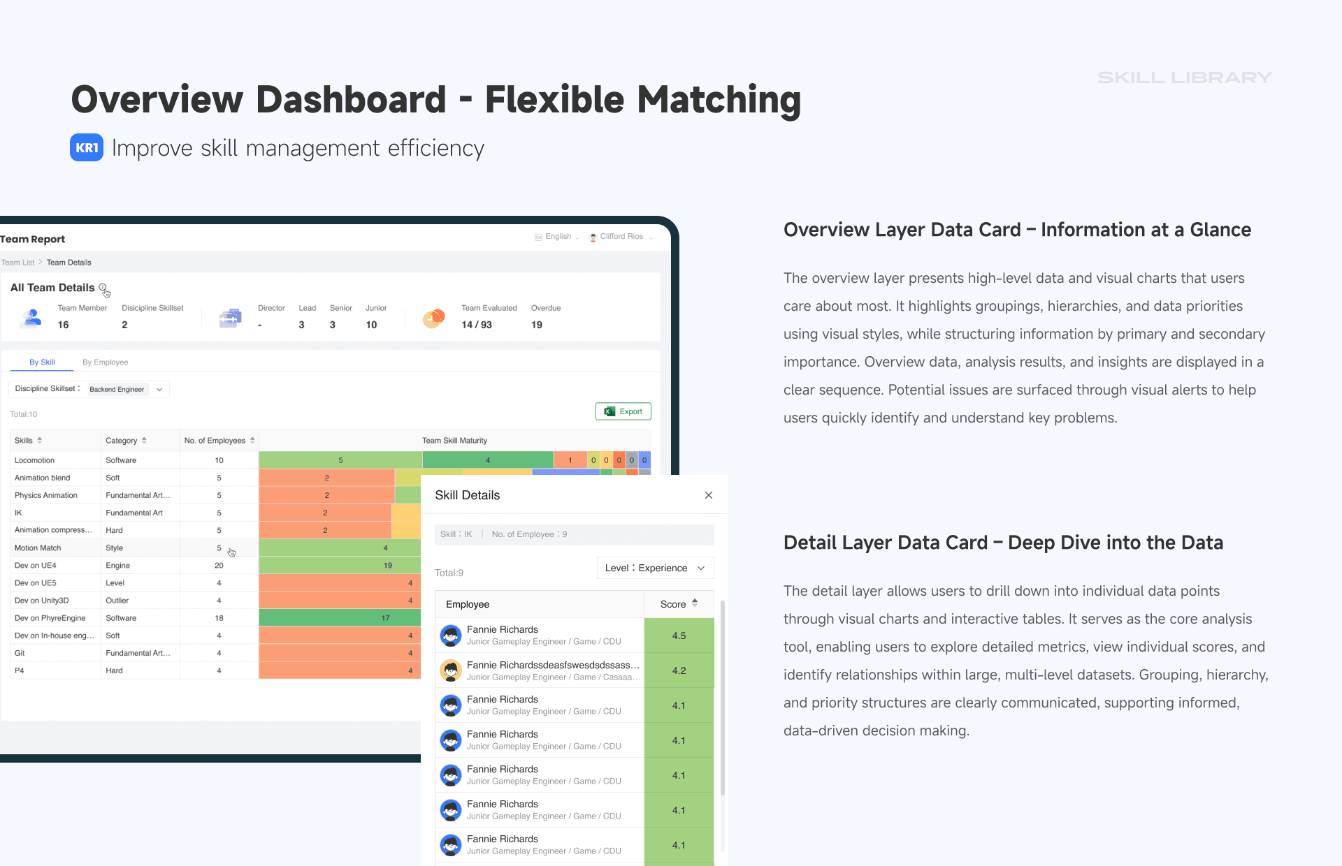
Skill Overview Dashboard
"At a glance, you know where the gaps are"
Traditional team charts don’t tell you where your blind spots are. So we designed a high-level overview that does.
Colored blocks indicate skill maturity
View toggle between skill-centric or member-centric
Click into any block for a deeper breakdown
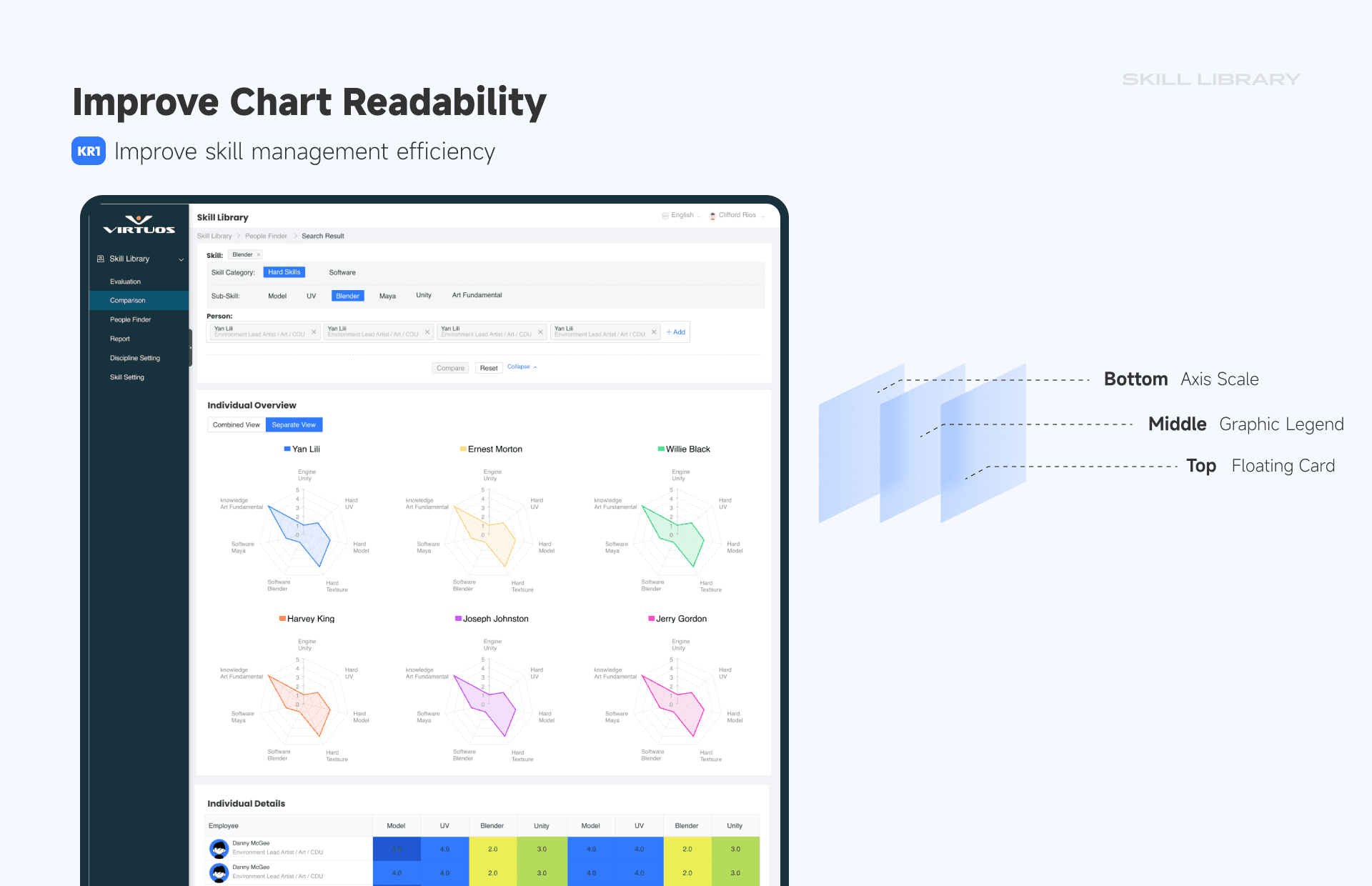
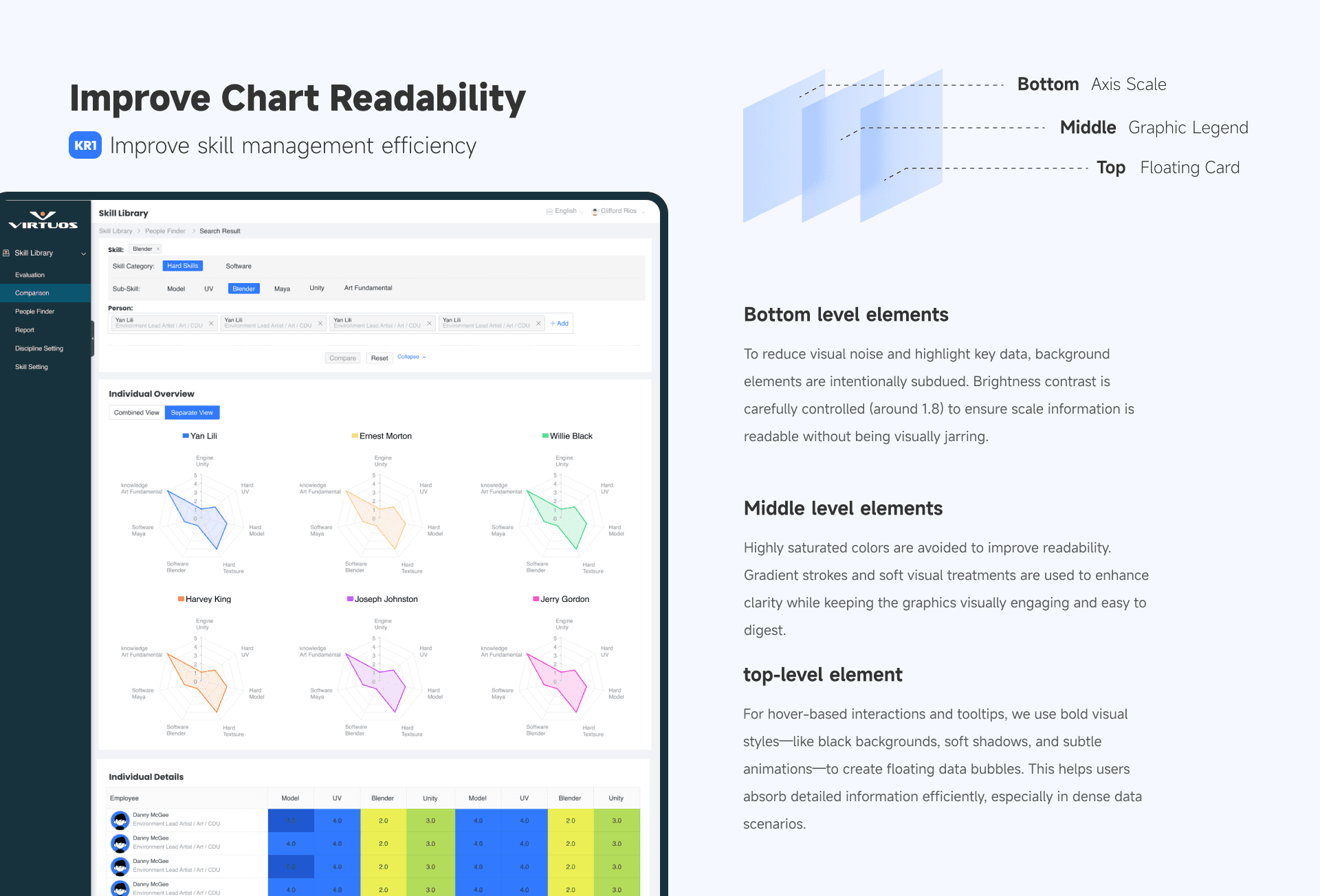
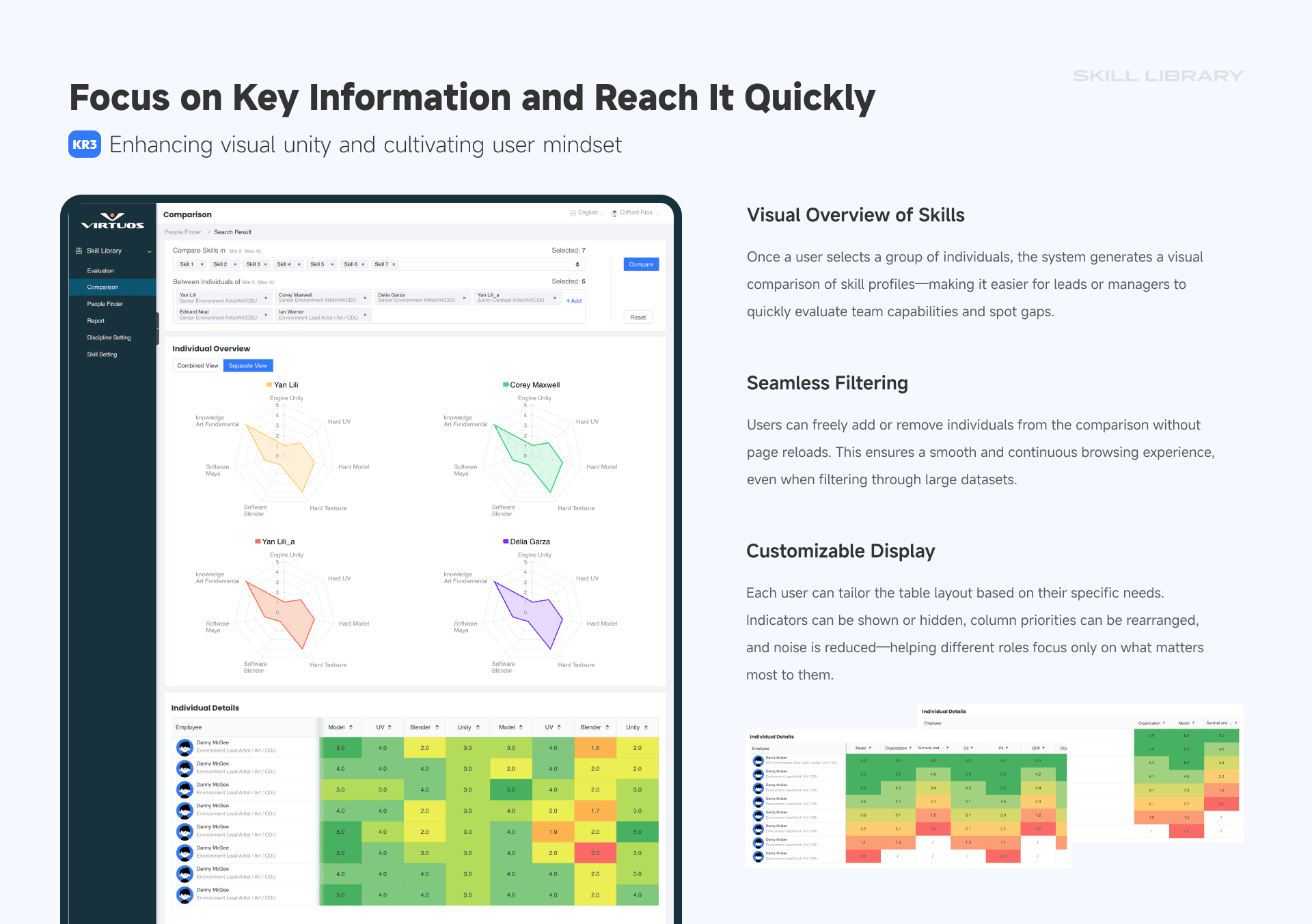
Skill Comparison, Visualized
"Compare multiple team members with ease"
Whether you’re building a team or promoting a lead, comparison matters. We used a combination of radar charts and heatmaps to visualize individual strengths and gaps.
Focused layout with minimal distractions
Hover reveals detailed scores
Toggle between group and individual views
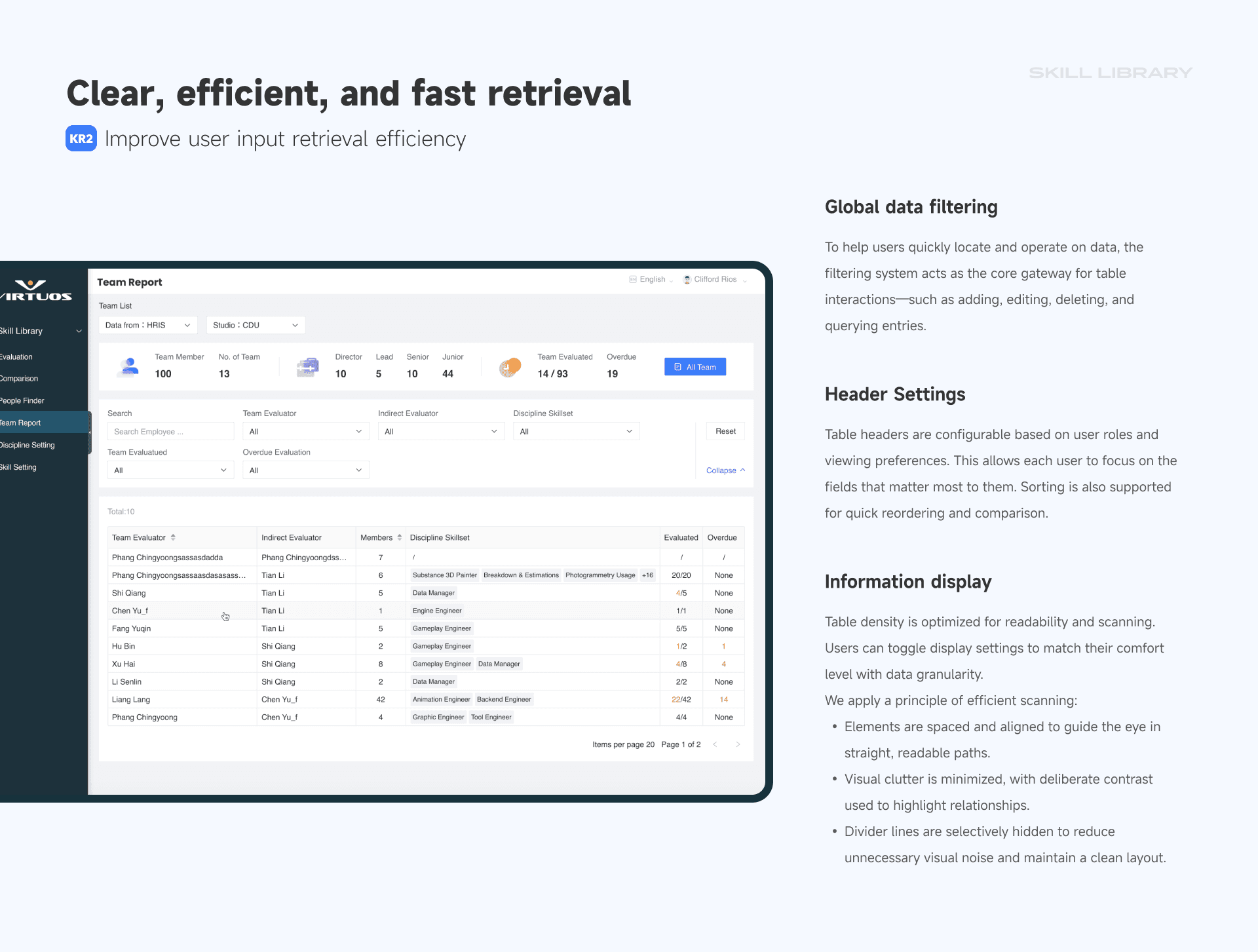
Team Report & Filters
"Make finding people less painful"
Even the smartest system fails if it’s frustrating to use. So we prioritized:
Multi-role filters (by skill, evaluator, department)
Flexible data columns (show what you care about)
Scan-friendly layouts optimized for quick reading
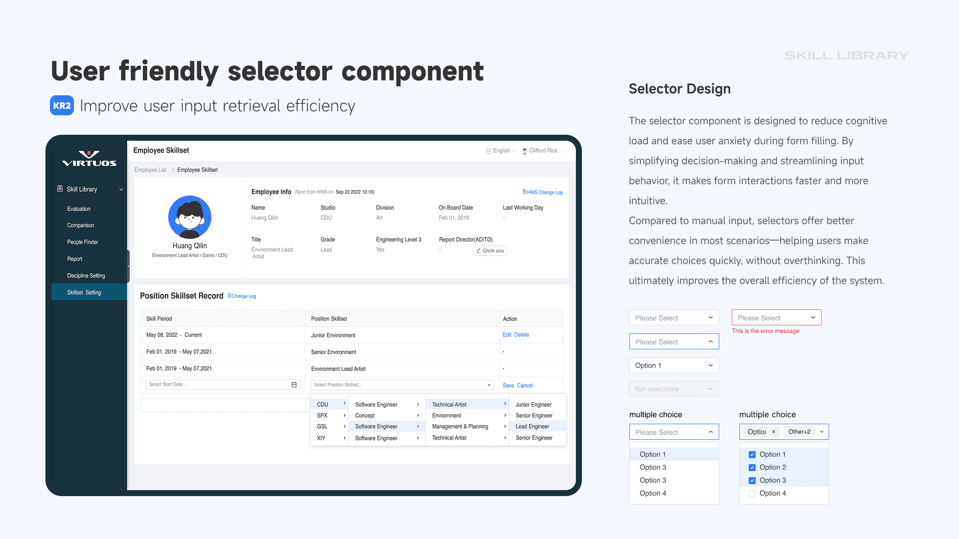
04 — Streamlined Selector Interaction
"Speed up input, reduce errors"
Skill evaluators often enter data manually—so we fine-tuned the interaction.
Smart defaults and pre-validation
Multi-select, disabled states, and logic rules
Frequent values show first to reduce friction
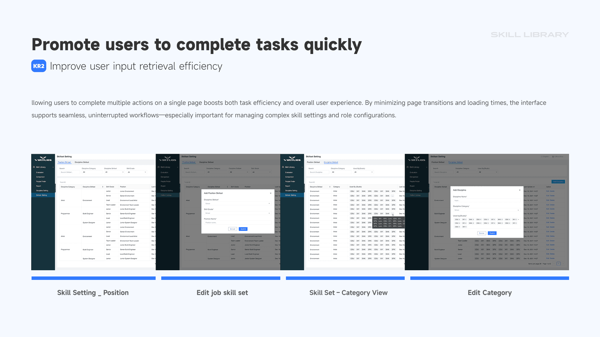
One Page for All Editing
"Set up everything in one place—fast"
Skill configuration is high-frequency, high-friction. We used dynamic forms with partial refresh to keep users in flow:
Add, edit, and bulk modify on the same screen
Dynamic tables with column filtering
No hard reloads—just seamless editing
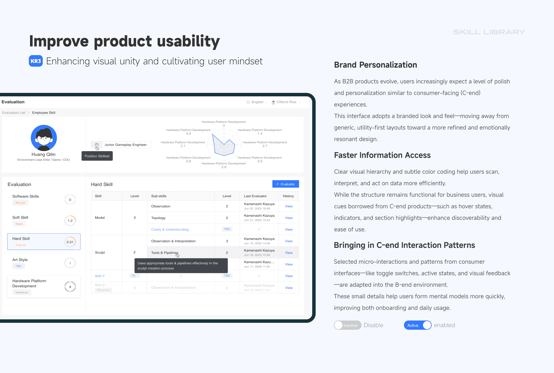
Personal Evaluation Panel
"Employees see their growth, not just their scores"
To increase transparency and ownership, we designed a growth panel:
Historical score timeline per skill
Split views for soft vs hard skills
Subtle “growth tree” visuals to track trajectory
Skill Comparison Panel
"Make better calls with visual context"
Sometimes you just need to pick the best person for a role. This feature helps leads compare candidates fast:
Radar view for horizontal comparisons
Skill heatmap for deeper inspection
Hide irrelevant metrics for cleaner focus
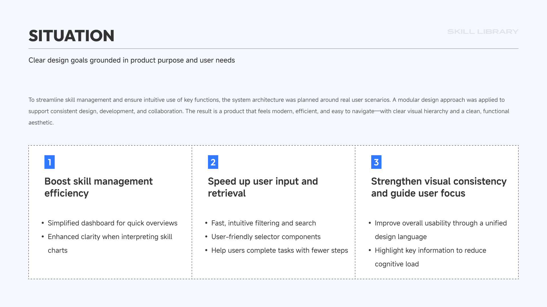
Design Principles
Modular Architecture: For easy expansion and reuse
Layered Information: Clear hierarchy for fast decisions
Neutral Aesthetic: Professional, minimal, B2B-friendly
Efficiency-First: Every layout serves decision speed and clarity
Why I Did This
I’ve always been drawn to enterprise tools and complex systems—not just making things look good, but making them actually work better. Tools like this, when thoughtfully designed, don’t just save time—they shape how people work and grow.
Virtuos represents one of the most fascinating design arenas: where creativity meets logistics, and collaboration spans time zones. This conceptual system was my way of practicing structured thinking, interface clarity, and UX strategy for scale.
It’s not about reinventing the org chart—it’s about designing a shared language for talent.

