Category:
Product Design · UX/UI
Created For:
Paula’s Choice
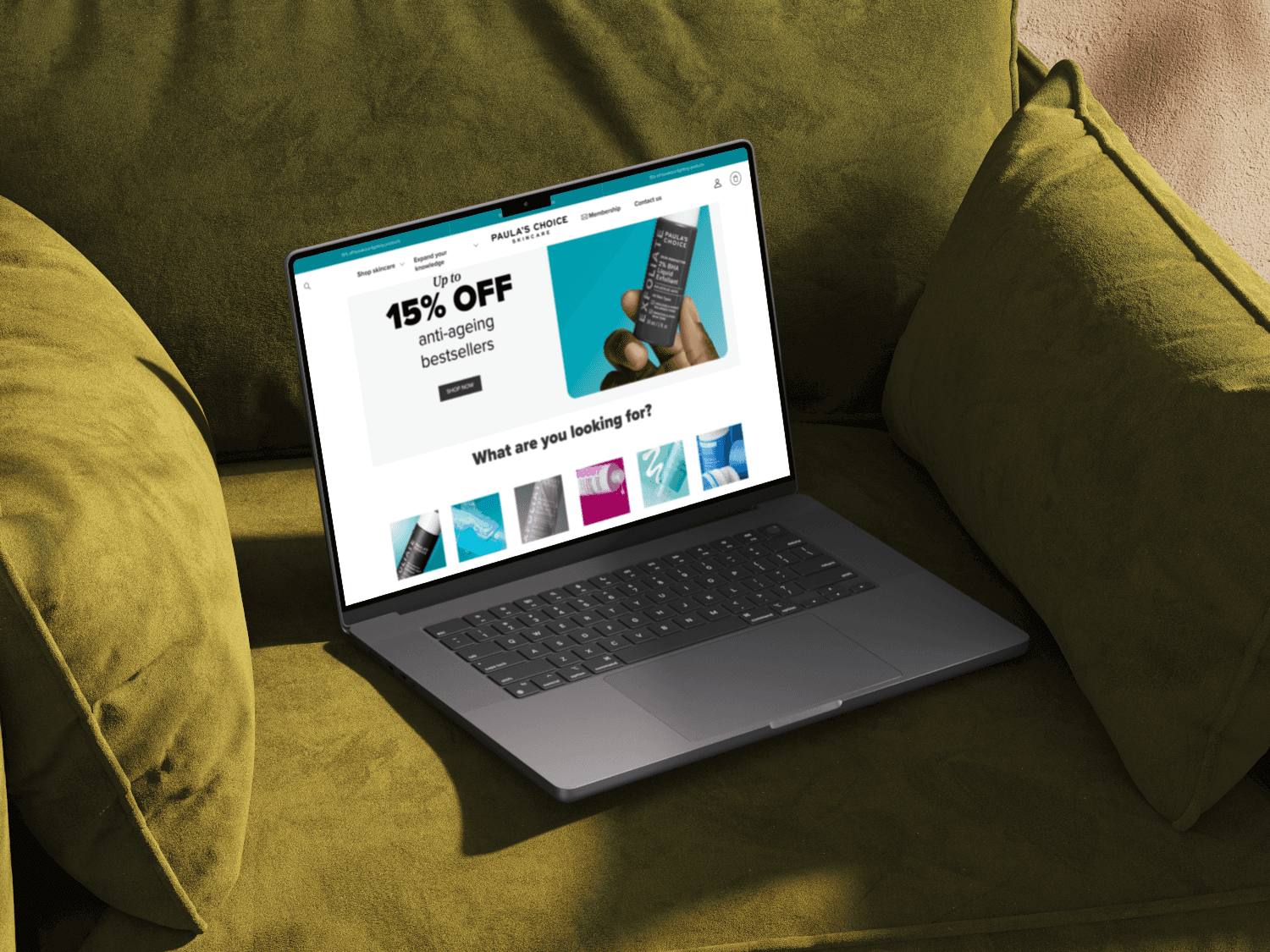
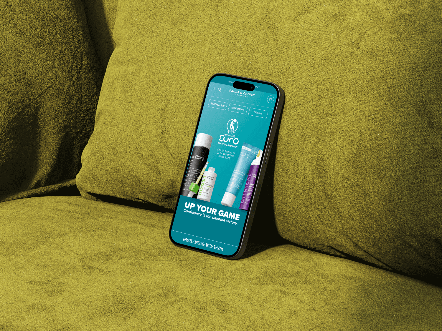
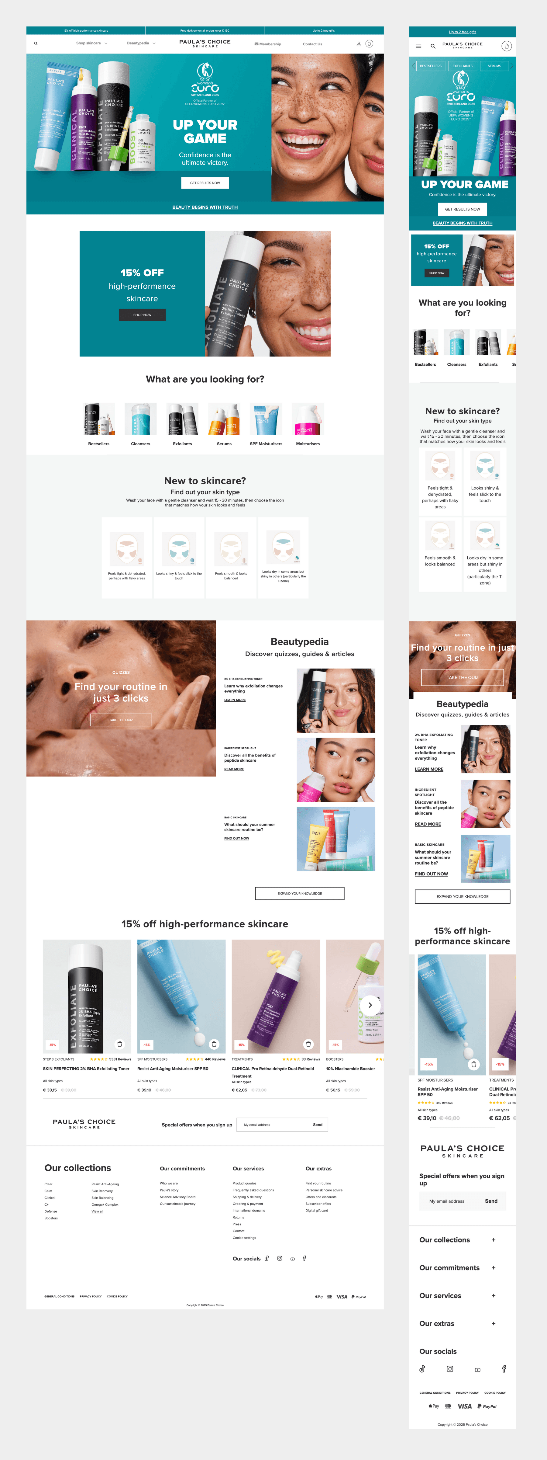
As the only UX Designer at Paula’s Choice Europe (now part of Unilever Prestige), I led a full redesign of our e-commerce homepage. The previous version, though functional, felt outdated and disjointed. With evolving business needs and increased focus on brand storytelling and discoverability, our team initiated a comprehensive revamp to modernize the page without compromising conversion.
The Challenge
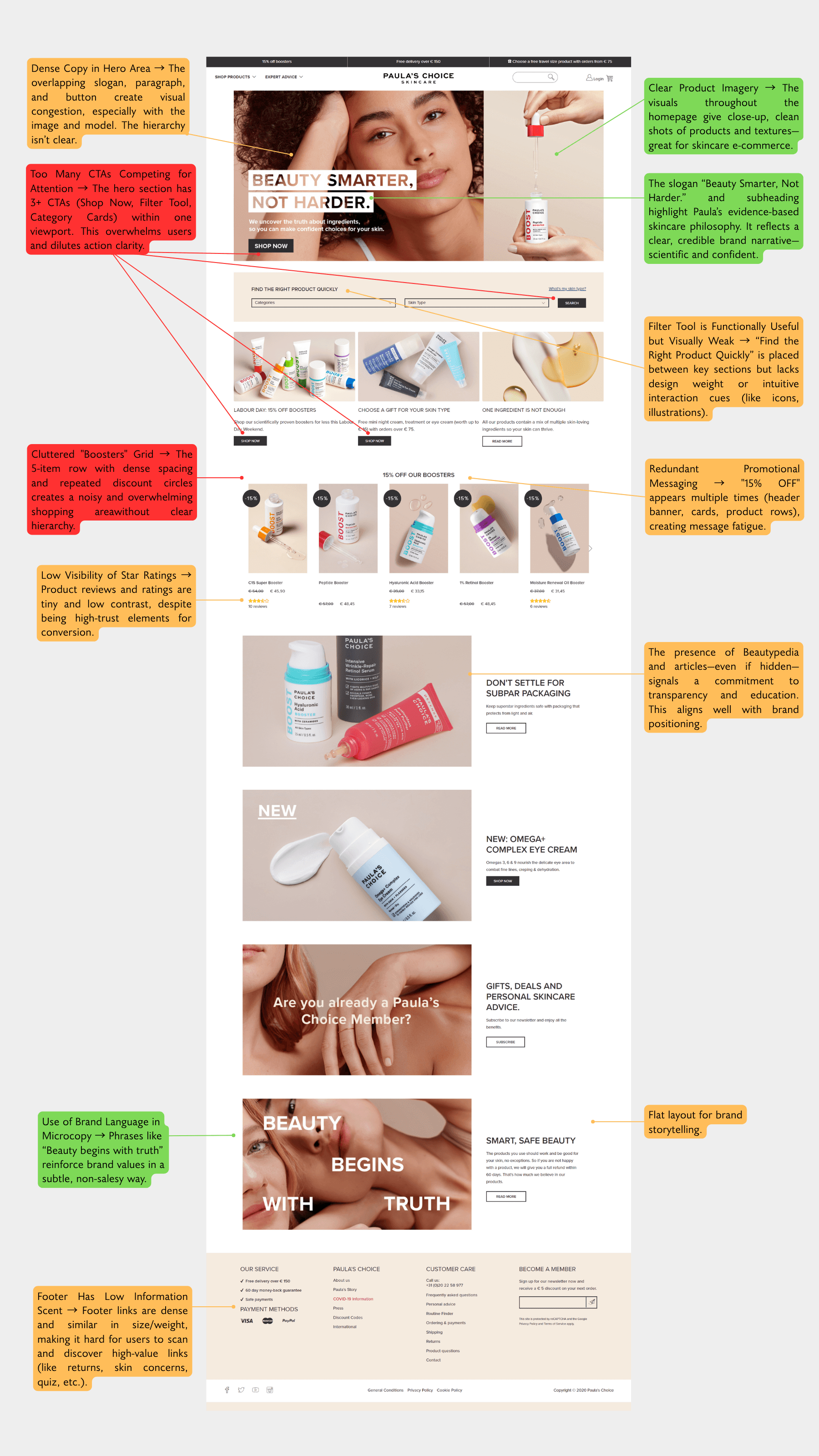
Fragmented layout: Content blocks were added ad hoc over time, creating inconsistency
Limited discoverability: Key tools like the skin analyzer and quick category access were hidden or hard to find
Legacy structure: Updating without hurting the conversion rate required data-informed caution
Goals & Success Metrics
We defined our objectives early on:
Increase discoverability of key content like the product discovery tool
Refresh outdated aesthetics to better reflect brand identity
Improve campaign flexibility for marketing teams
Lay a foundation for scalable, block-based architecture across Salesforce Commerce Cloud
Enhance user experience without negatively impacting conversion rate
Success would be measured by:
A/B test performance (conversion, CTR)
Scroll depth and click maps from Hotjar
Stakeholder satisfaction and usage flexibility
Research & Insights
We used a combination of Hotjar, Google Analytics, and A/B testing data to uncover how users interacted with the homepage.
Key insights included:
Users heavily interacted with campaign blocks and discovery tools but often missed them due to poor visibility.
Scroll behavior showed drop-off around the third block, signaling a need for stronger visual rhythm.
Mobile performance lagged slightly in engagement, especially when discovery tools were buried below the fold.
Design Process
We began with quick ideation sessions using methods like Crazy 8s to explore alternative structures and modular ideas. Once aligned, I created wireframes and then transitioned into high-fidelity design, always keeping modularity in mind for implementation on Salesforce.
The homepage was broken down into functional blocks such as:
Hero + Campaign Banner
Quick Access Carousel
Product Discovery Tool
Featured Categories & Educational Content
Brand Story & Testimonials
Each block was validated with stakeholders and prioritized for staged rollout.
Stakeholder Collaboration
Since the homepage plays a strategic role across multiple departments, I actively gathered input from:
Marketing: campaign needs and banner placement
Product/Content team: search, quiz tools, category promotion
Customer Care: accessibility, pain points, user feedback
We held structured reviews and documented requirements to ensure modular flexibility while still honoring our UX principles.
Implementation & QA
We worked with a Salesforce-based development team, and I coordinated with them directly to hand off specs, document responsive behavior, and monitor releases.
Each block was delivered and deployed in phases. I created detailed documentation per block, including responsiveness guidelines, interaction notes, and fallback behaviors.
Before each go-live, I conducted QA on staging environments and worked closely with the devs to ensure visual and functional consistency.
A/B Test Results
Hypothesis
If we redesign the homepage to reduce promotional clutter and emphasize brand storytelling, users will experience the brand more meaningfully without negatively affecting CVR, AOV, or RPU.
Metric | Control | New Checkout | Difference |
|---|---|---|---|
CVR | -* | -* | +1.3% (Not significant) |
AOV | -* | -* | –1.4% (Not significant) |
RPU | -* | -* | +1.6% to +6.4% depending on country (Not significant) |
✅ Hypothesis directionally supported: Revenue metrics stable or slightly improved in multiple markets
📉 CVR down in some regions (e.g. NL: –4.7%) but up in others (UK: +2%) — not statistically significant
📈 AOV generally improved on desktop (+3.5%), dipped slightly on mobile
🔍 Product engagement behavior changed — more clicks on filters, fewer on promo/video blocks
*Exact figures cannot be disclosed due to company confidentiality.
Outcome & Learnings
Desktop performance improved significantly over mobile, especially in AOV
Revenue remained stable or improved in all key markets (Germany, France, UK, NL)
Click behavior redistributed across the page, with more engagement on navigation filters and fewer on sliders or promo banners
Brand storytelling sections saw greater visibility, creating a more balanced visual hierarchy
No negative impact on revenue per user, supporting brand-forward design without sales compromise
⚠️ Room for improvement
Hero video button saw 33% fewer clicks, even with the same content
Featured articles with video/image had lower than expected CTR, despite strong placement
Further mobile optimization needed — mobile AOV dropped slightly, especially on listing pages
New design requires additional user testing to understand perception gaps and layout behavior
Reflection
This project was more than just a visual refresh — it was an opportunity to rethink how our homepage could tell the Paula’s Choice story, guide users with purpose, and remain performant.
I’m especially proud of how we balanced cross-team needs while keeping UX at the center, and how we built a modular system that could evolve with the brand.
If given more time, I would have loved to test personalization modules or audience-segmented hero banners.

