Category:
UX Design, E-Commerce
Created For:
Paula’s Choice

Background
As part of our shift toward a headless e-commerce architecture, we faced multiple urgent pressures to redesign our checkout experience:
Technical trigger: Adyen stopped supporting our legacy Salesforce integration. We migrated to a composable setup using Contentstack as CMS.
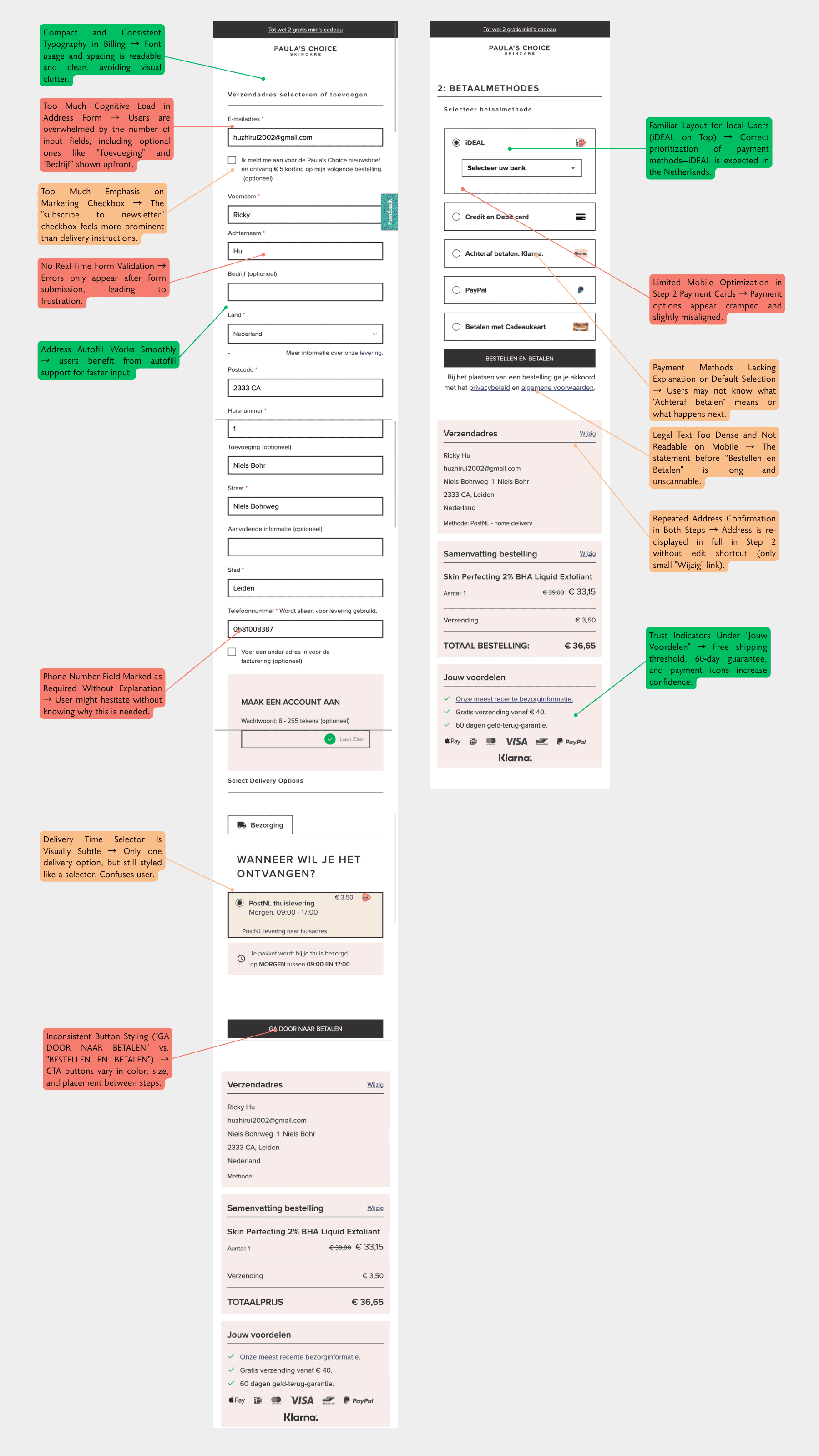
UX trigger: The legacy checkout was overly long, cluttered, and fragmented across our 7 regional websites, each with slightly different field needs. For example:
"Packstation" fields were displayed to all countries, even those not using the service.
Mandatory house number or company info fields appeared in markets where they weren’t needed.
The form appeared bloated and irrelevant, leading to errors and user drop-offs.
The redesign was not just about UI; it was a strategic infrastructure move, decoupling checkout from Salesforce to support long-term scalability.
Goal
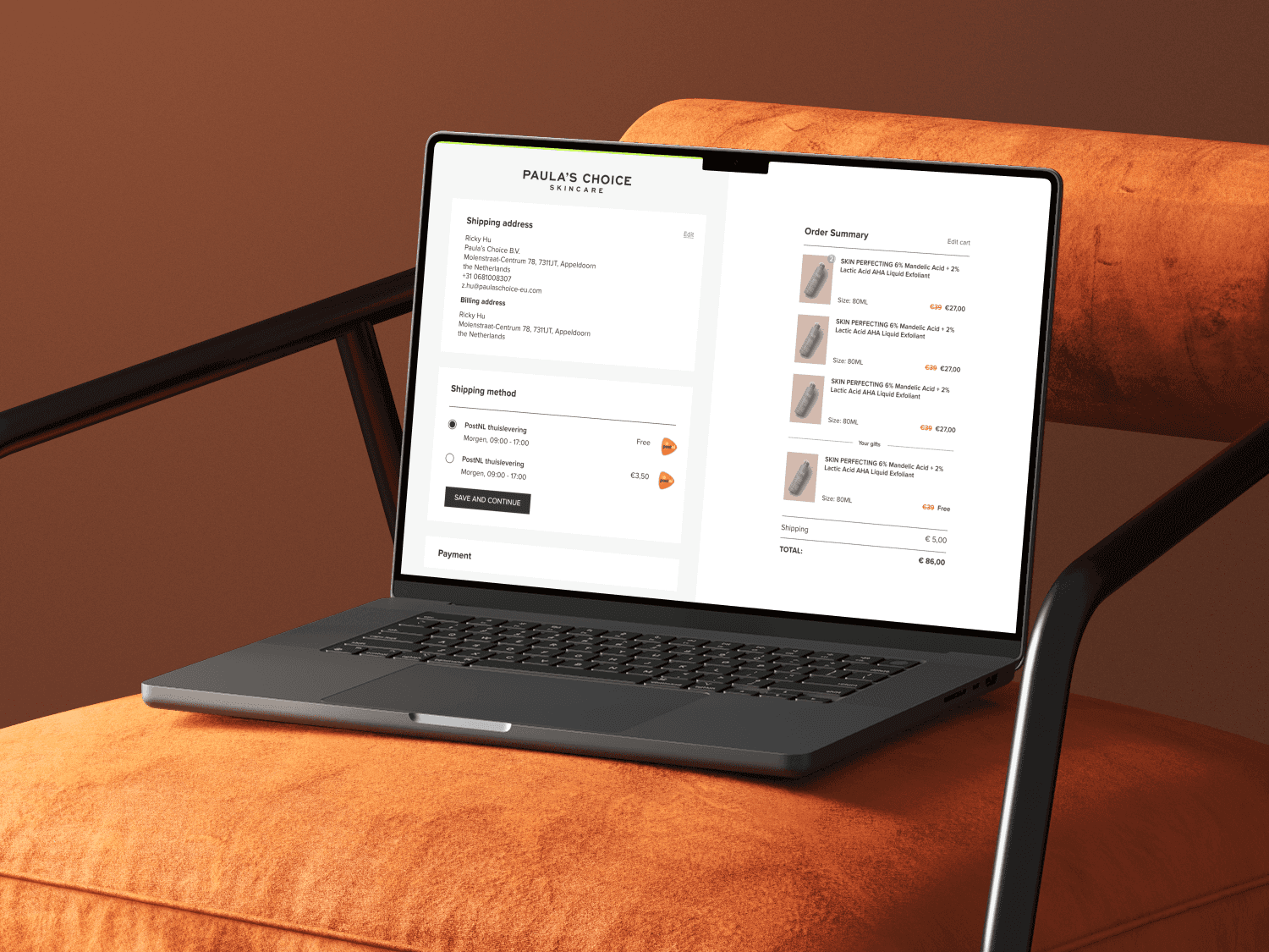
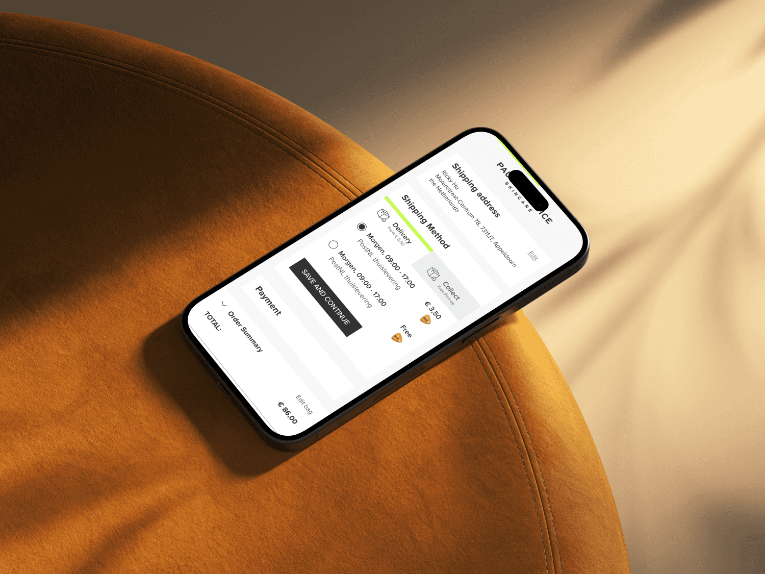
Create a streamlined, modern one-pager checkout that:
Reduces friction and confusion
Collapses irrelevant sections with progressive disclosure (folded steps)
Allows easy in-place editing
Supports local logic (e.g. country-specific field requirements)
Works seamlessly with modern payment methods and backend integrations
Research & Methodology
Our redesign was backed by layered research:
Quantitative:
5+ years of A/B test history on legacy checkout
Google Analytics & revenue tracking for CVR, AOV, RPU
Session-based behavioral analysis via Hotjar (~100 recordings/day during test phase)
Qualitative:
Usability testing with real users across key markets
Stakeholder interviews from e-commerce, data, and customer support teams
Competitive benchmarking (e.g. how brands like Zalando or Sephora handle one-pager checkouts)
My Role
I led the UX Design for this high-impact project, owning:
Flow logic and UX strategy
Field-level logic mapping across 7 country-specific checkouts
Wireframes → high-fidelity mockups (Figma)
Design QA & collaboration with frontend/backend devs
Design decisions around components like:
Payment method selection
Gift card handling (moved from "payment" to "promo" for better UX & tech feasibility)
Inline validation + visual summary
Synthesizing daily insights from Hotjar, collaborating closely with e-commerce analyst
Collaboration was mainly with:
E-commerce team · Dev & IT · Data team (no marketing/legal dependencies in this phase)

Hypothesis
If we redesign the checkout with a composable architecture, we will not observe significant drops in CVR, AOV, or RPU — because the new UX is optimized for a smoother and clearer experience.
A/B Test Results
Metric | Control | New Checkout | Difference |
|---|---|---|---|
CVR | 94.7% | 94.4% | -0.3% (Not significant) |
AOV | -* | -* | -0.4% (Not significant) |
RPU | -* | -* | -0.7% (Not significant) |
✅ Hypothesis confirmed: No significant revenue drop
📉 Add-to-cart dropped on listing pages (-xx%*)
📈 But increased on PDP (+xx%*) → Indicates stronger product purchase intent
*Exact figures cannot be disclosed due to company confidentiality.
Outcome & Learnings
Revenue metrics remained stable across core markets
Checkout became visually and functionally cleaner, localized, and less error-prone
Removed the need for users to navigate multiple steps and external loading pages
Gift card UX simplified, backend constraints reduced
⚠️ Room for improvement
UK market showed CVR dip tied to account creation friction — now prioritized for next iteration
Some payment methods temporarily malfunctioned due to integration issues — resolved via Hotjar monitoring
Final Thoughts
This project proved the value of thoughtful UX grounded in both behavioral and technical research. It was not just a visual refresh — it was a structural transformation that made our checkout faster, smarter, and future-ready.

