Category:
Product Design · UX/UI
Created For:
Paula's Choice
Introduction
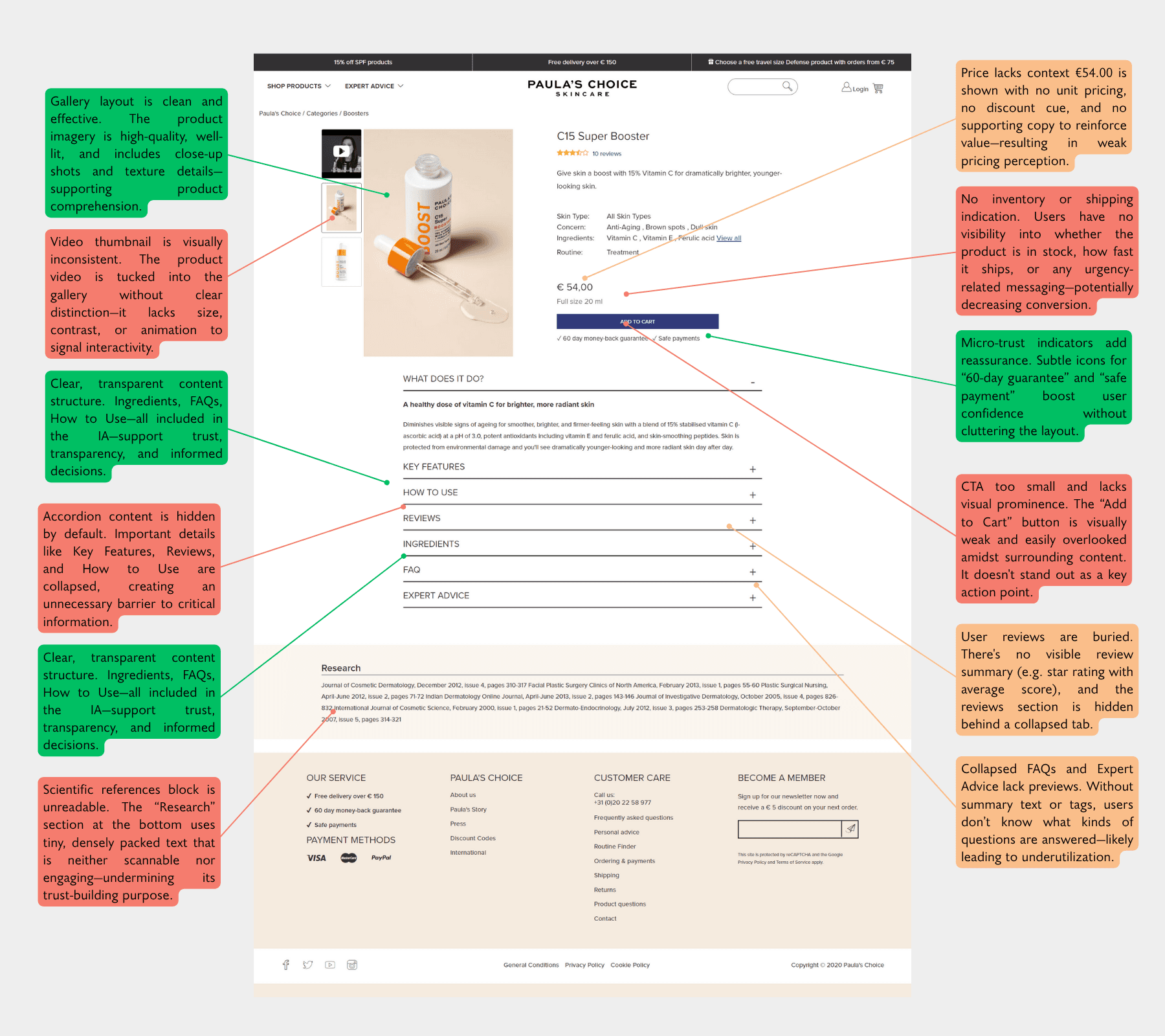
After redesigning the homepage, we realized the next critical bottleneck was the Product Detail Page (PDP). The old layout, heavily reliant on collapsible carousels, limited how much product content we could display. Key information was hidden or scattered, negatively impacting the clarity of our product presentation.
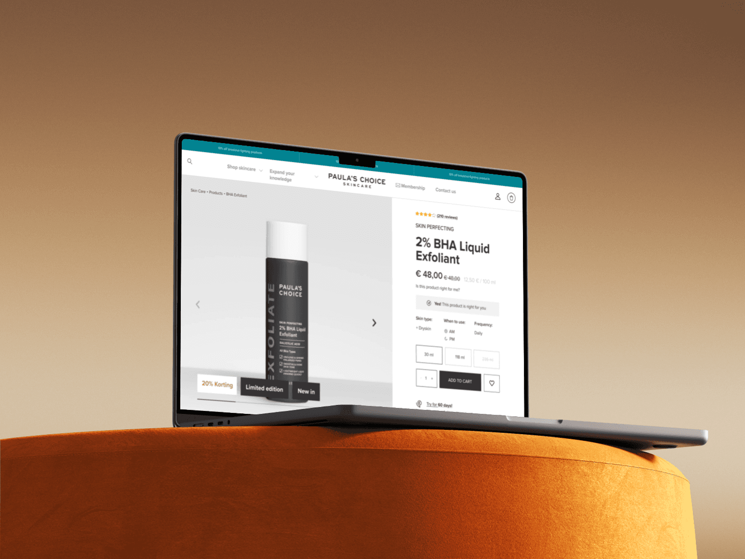
Our goal was to rethink the PDP to better support content-rich modules, enable future extensibility, and align visually and structurally with the new homepage—all while preserving conversion rate performance.

Problem
Content limitation: Old PDP relied on collapsible sections (accordion/carousel) that hid most key information.
Inconsistent information hierarchy: Content was often not aligned with users’ purchasing journey.
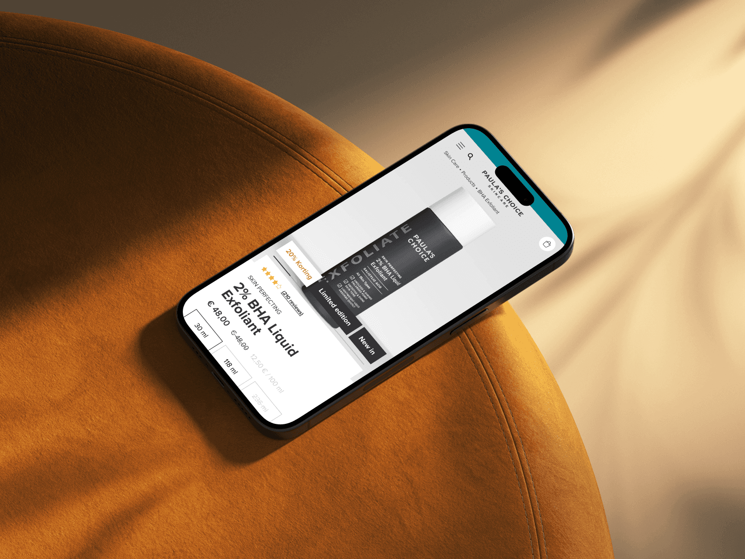
Poor mobile experience: The layout did not scale well with our mobile-first strategy.
Limited personalization: The layout lacked space to support product recommendations or new tools like Routine Finder.
Data-Driven Opportunity
This redesign was initiated based on user behavior data from Hotjar and Google Analytics. Bounce rate was high, average engagement time was low, and content discoverability was poor—especially on mobile.
Furthermore, we recently developed a tool that acts as a Routine Finder: users answer a few skin-related questions, and products are marked as Yes / No / Maybe based on fit. This needed clear placement on the PDP.
Process
The process largely mirrored our homepage redesign but was more technically constrained.
UX Audit + Data analysis
Wireframing and prototype creation
Stakeholder alignment (product, marketing, visual design, copy)
Design refinement + QA
Salesforce implementation coordination
A/B Testing (→ see section below)
We aligned closely with the Homepage's modular system, aiming for a "block-by-block" composition. However, technical challenges meant we couldn't implement a fully flexible CMS structure. Ultimately, we went live with a predefined modular layout, then optimized further.
My Role
I led the UX and UI design process, from problem framing to final QA. This included:
Creating interactive prototypes
Aligning cross-functional teams on scope and feasibility
Running Hotjar and click-map studies to define priorities
Incorporating learnings from earlier PDP A/B tests
Owning QA on live environment before and after go-live
Collaborating with dev team to resolve implementation edge cases

Results
We conducted a post-launch A/B test on the new PDP version to validate performance. Quantitative and qualitative feedback post-launch showed a clear improvement:
✅ Bounce rate: ↓ 26.8%
✅ Engagement time: ↑ 3.02%
✅ Sessions: ↑ 57.65%
✅ Total revenue: ↑ 115.7%
✅ Add-to-cart rate: ↑ 75%
✅ Click heatmap: More distributed interaction across content modules (vs. concentrated taps previously)
Learnings
Mobile-first structure matters. Thoughtful stacking and content visibility improves engagement.
Don’t hide content. Collapsing too much behind accordions reduces exploration.
Modular design isn’t just about CMS flexibility, it’s about clear storytelling.
Heatmaps and engagement metrics offer ongoing opportunities for iterative optimization.
What could be improved next
Implementing true CMS-level modular flexibility
Experimenting with personalization modules (e.g., real-time skin match confidence score)
Adding lightweight animations to improve scroll pacing and section discoverability


