Category:
Fintech Concept
Created For:
Concept project

A conceptual design project focused on making wealth management less intimidating and more emotionally supportive.
Background
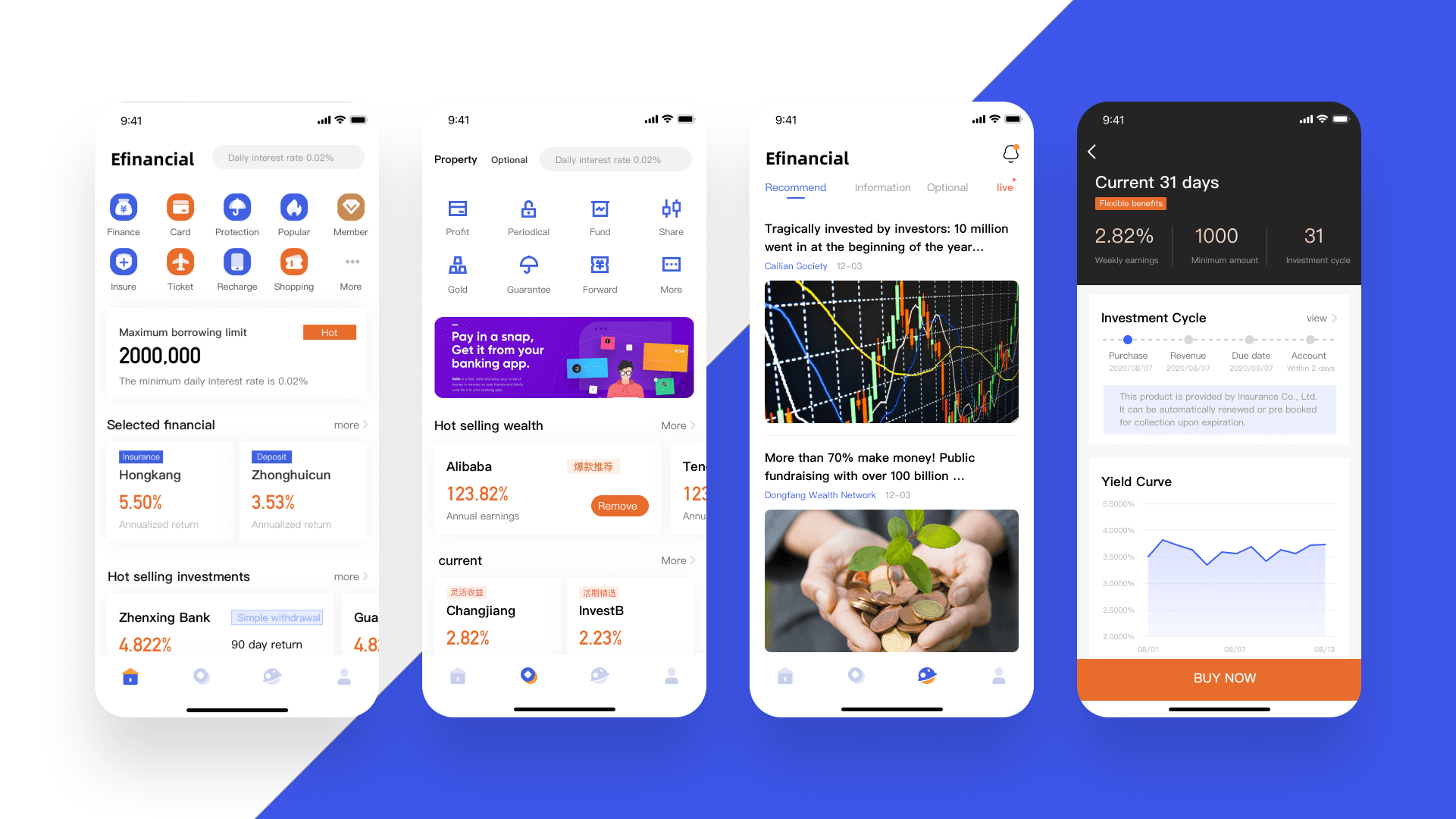
Efinancial is a conceptual mobile platform that explores how to help users manage their finances more intuitively. It offers a range of services—from savings and investments to insurance and personal finance insights.
The goal was not just to cover product functions, but to build an experience that feels friendly, calming, and emotionally supportive—especially for users who are anxious about money.
Product Vision
We defined three core product values:
User-Centered Experience – empathetic, easy to understand, and emotionally inclusive
Efficient & Streamlined – minimum effort, maximum clarity
Trustworthy by Design – clear structure and honest language to reduce user anxiety
User Research
We surveyed and interviewed users with varying levels of financial experience to understand how they track and manage money.
Key Findings:
83% of users have no structured habit of financial tracking
Many users record transactions in batches (every few days)
Most people experience emotional fatigue or confusion when dealing with numbers
There's a gap between users' financial goals and their daily habits. Tools need to not only “do the job” but also support the mindset behind money decisions.
Personas
Wang Tongqing
“The more I track, the more I panic. I want something simple and calming.”
Motivation: Simplicity, visual clarity
Need: A low-friction tool to reduce emotional resistance
Li Bingwen
“I always switch between apps. I wish I could customize my own toolkit.”
Motivation: Flexibility, completeness
Need: Modular, adaptable functions that suit personal finance styles
Design Approach: From Functional to Emotional
Iceberg Model
We mapped both surface-level needs and deeper emotional drivers:
Visible Needs: Efficient operation, clear data, asset visibility
Deeper Needs: Avoid information overload, reduce pressure, build confidence
This inspired us to create a lightweight, visually calm product flow.
UI System Highlights
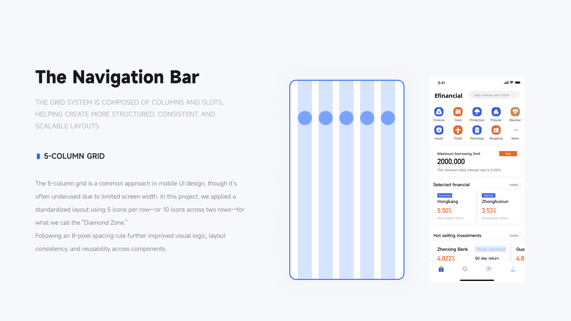
Grid Structure
We used a 5-column grid and an 8px spacing system to ensure consistency and visual order, especially important in information-heavy screens.
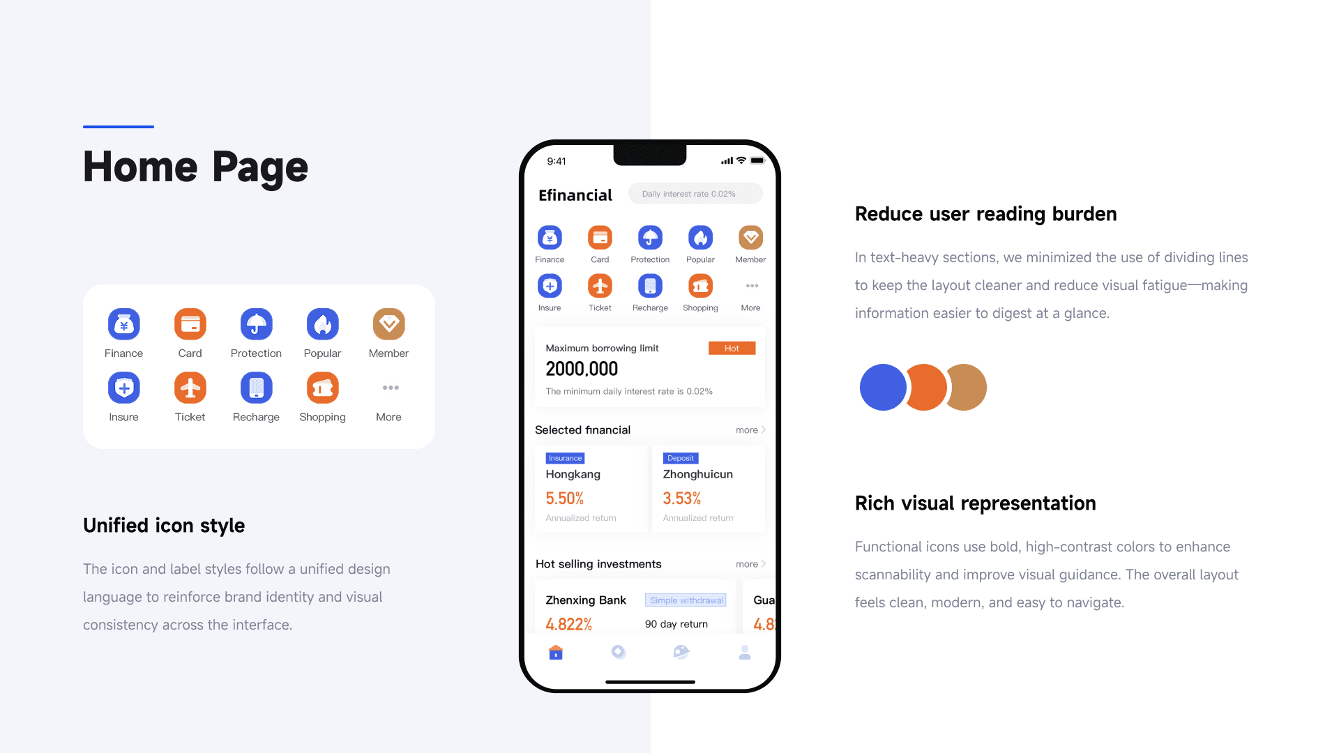
Homepage
Unified icon styles
Reduced segmentation lines to lower visual burden
Strong use of color for hierarchy and guidance
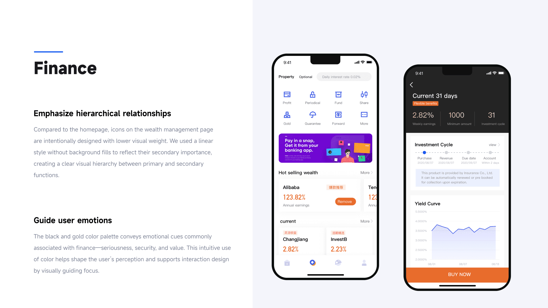
Finance Section
Linear icons to separate this section from the more “active” homepage
Black-gold color scheme for a sense of calm and reliability
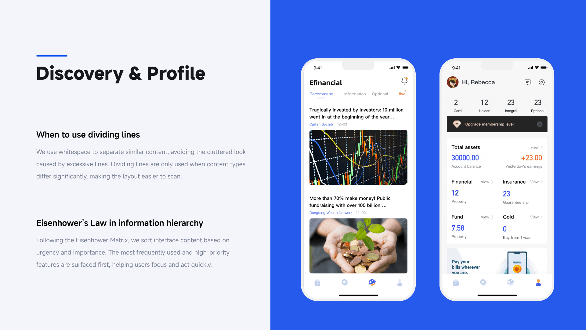
Discovery & Profile
Whitespace used instead of dividers to avoid visual clutter
Information sorted using Eisenhower Matrix: what’s urgent and important goes first
What I Learned
This project helped me realize that financial tools aren't just functional—they're emotional. People need structure, yes, but more than that, they need emotional permission to feel safe while engaging with money.
As a designer, I learned to pay more attention to tone, friction, and even whitespace—all of which can influence trust, anxiety, and confidence in subtle ways. It pushed me to design beyond interface, and into user mindset.

