Category:
UX Design, E-Commerce, Product Discovery
Created For:
Stokke, Case Study


Background
Stokke’s Tripp Trapp is a well-known hero product line with a strong brand story: a chair designed to grow with the child and become part of everyday family life.
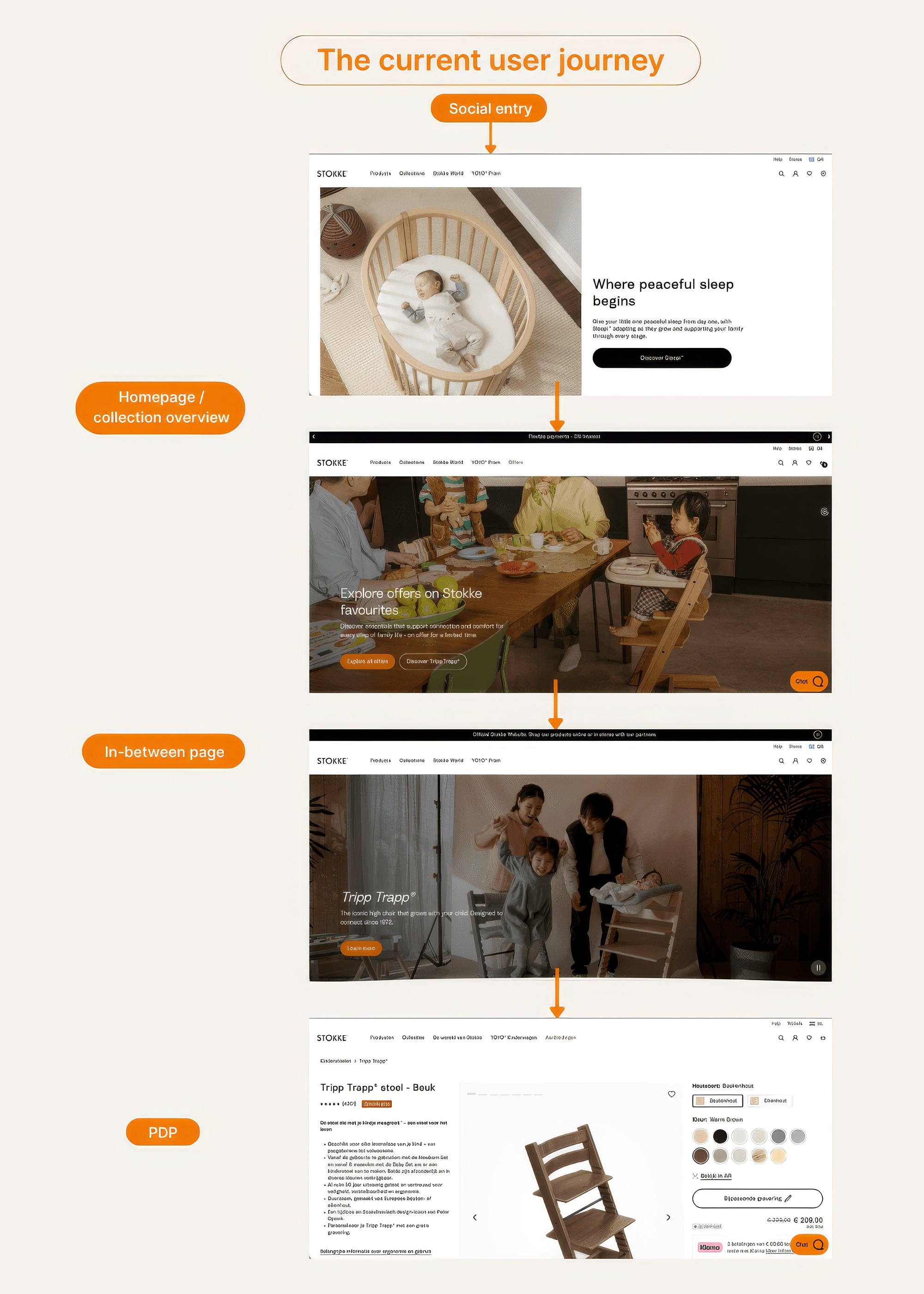
During the case exercise, I reviewed the current journey from a social-entry route into the Tripp Trapp product experience. The goal was not simply to redesign a page visually, but to understand how the journey supports discovery, decision-making, and conversion.
The existing journey contains several layers: social entry, homepage or collection overview, an in-between product-family page, and one or more PDP states. While this structure gives space for storytelling, it also creates overlap between learning and buying. The product-family page explains the range, while the PDP still needs to explain, guide, configure, and sell. As a result, users may understand the product eventually, but the path to purchase can feel longer and less direct than it needs to be.
This project explores how the journey could be simplified while still preserving the premium, family-oriented storytelling that makes Tripp Trapp distinctive.
Goal
The goal was to improve both discovery and conversion in the Tripp Trapp journey.
I treated discovery not only as whether users could find Tripp Trapp, but whether they could quickly recognise the right path into the product family with minimal interpretation. In this context, discovery is about path clarity, not just page reach.
From a conversion perspective, the goal was to reduce friction between product interest and purchase action. That meant clarifying page roles, reducing unnecessary decision noise, and making the PDP more effective as a guided purchase environment.
The project focused on three questions:
How can users understand the Tripp Trapp range faster?
Where does the current journey create avoidable hesitation?
Which page should own the main decision-to-purchase flow?
Research & Methodology
The assessment combined three inputs: a directional usability check, expert review, and competitor benchmarking.
For the usability input, I ran a small unmoderated study with 8 external participants using Lyssna (see results here)
The tested route was based on Stokke’s real Instagram link-in-bio entry. One important observation was that the entry state was not fully stable across users. Some participants stayed in what appeared to be an original market state, while others selected their own country and were redirected to their local homepage. Even with this variation, users still converged into a similar Tripp Trapp discovery flow, making the middle and later parts of the journey especially important.
The research was not intended to be statistically conclusive. Instead, it was a focused directional check to surface recurring friction and inform design judgement.
Research snapshot
The usability check suggested that basic findability was not the main issue. All 8 participants completed the task, and 88% described identifying Tripp Trapp and reaching a relevant product page as easy or very easy. However, the open responses and recordings showed that users still had to do extra interpretation work before they could move confidently from discovery into purchase.
The key patterns were expectation mismatch, choice hesitation, navigation clarity, recognition gap, and commercial clarity gaps.
Theme | Evidence from participants | UX interpretation | Design implication |
|---|---|---|---|
Expectation mismatch | Some users expected “Discover Tripp Trapp” to lead closer to a PDP, but reached an overview-style page first | CTA expectation and destination role were not fully aligned | Clarify whether the page is for learning or buying |
Choice hesitation | Users could find Tripp Trapp, but hesitated when faced with multiple setup options | Discovery was possible, but progression was not always decisive | Reduce decision ambiguity before purchase |
Navigation clarity | Some users found Tripp Trapp in navigation, but were unsure which option to choose next | Navigation exposed the product, but did not always guide users into the right path | Simplify entry routes for brand-aware and need-led users |
Recognition gap | Users unfamiliar with Tripp Trapp did not immediately understand it as a high-chair solution | Product-name-led discovery works better for brand-aware users | Add clearer category and life-stage cues |
Commercial clarity gaps | Some users wanted clearer pricing, bundle contents, shipping, or purchase signals | Purchase confidence depends on visible commercial information | Strengthen PDP purchase-readiness |
Content helped understanding | Product images, descriptions, and homepage messaging helped users understand the product | Existing content has value, but needs better structure | Keep storytelling, but layer it after key decision support |
The competitor benchmark supported the same direction. The issue did not appear to be a lack of content. The bigger opportunity was conversion-focused structuring: making the commercial state clearer, guiding selection more actively, and layering information for different reading behaviours.
In my own work, I often think about this as designing for skimmers, swimmers, and deep divers: users who want the headline, users who need enough detail to move forward, and users who want to go deeper before deciding. The current Tripp Trapp journey often asks all three user types to behave like deep divers too early.
My Role
I led the UX thinking and design direction for this concept case, covering:
journey review and problem framing
usability test setup and synthesis
competitor benchmark analysis
information architecture and page-role strategy
redesign of the supporting product-family page
redesign of the PDP into a guided product builder
prototype creation and presentation narrative
The work was completed as a self-contained case exercise, so I did not have access to Stokke’s internal analytics, backend data, or actual conversion performance. The outcome should therefore be read as a directional concept rather than a production-ready recommendation.
Hypothesis
If the primary Tripp Trapp purchase journey is simplified by moving the main decision flow into a guided PDP / builder, users will need less interpretation between discovery and purchase.
This should improve the journey in two ways:
Discovery becomes clearer because the product-family page focuses on orientation, life-stage logic, and routing rather than trying to act as a decision-heavy purchase layer.
Conversion becomes stronger because the PDP takes clear ownership of setup selection, commercial clarity, configuration, and Add to Cart readiness.
Design Direction
The key design decision was to clarify the relationship between the product-family page and the PDP.
The current journey often behaves like this: Homepage or collection overview → in-between product-family page → one or more PDP states → purchase
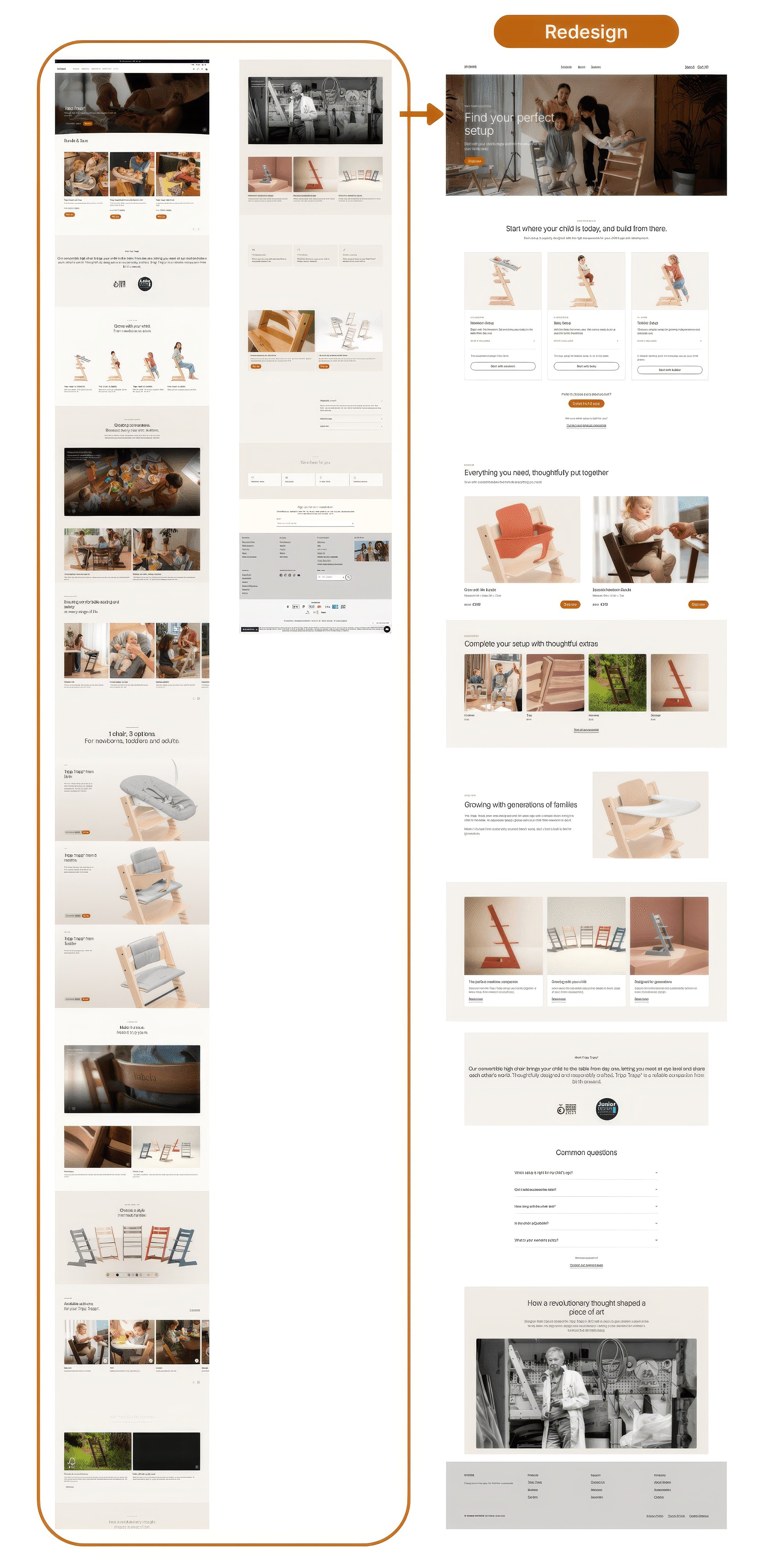
My proposed direction simplifies the primary purchase path: Homepage or collection overview → guided PDP / builder → purchase
In this model, the in-between page still exists, but its role changes. It becomes a supporting product-family page for browsing, understanding, and storytelling rather than a required step in the main purchase flow.
This distinction is important. The goal is not to remove storytelling. The goal is to place storytelling where it supports the journey rather than slowing down the critical conversion path.
Design Response 1: Supporting Product-Family Page
(Prototype link here)
The revised in-between page becomes a lighter orientation layer.
Its purpose is to help users understand the Tripp Trapp range, understand the life-stage logic, and move toward the right next step with more confidence.
I kept the stage-based structure because it still reflects the essence of Tripp Trapp as a product family. However, the role of those stage entries changed. They are no longer there to split users into separate isolated product pages. Instead, they help users recognise the direction that fits their situation and move into a more relevant purchase step.
This improves discovery because the page is no longer trying to do too much. It explains the range, supports browsing, and routes users onward more clearly.
Bundles, accessories, and story content remain present, but they sit in secondary roles. They support understanding rather than competing with the main buying flow.
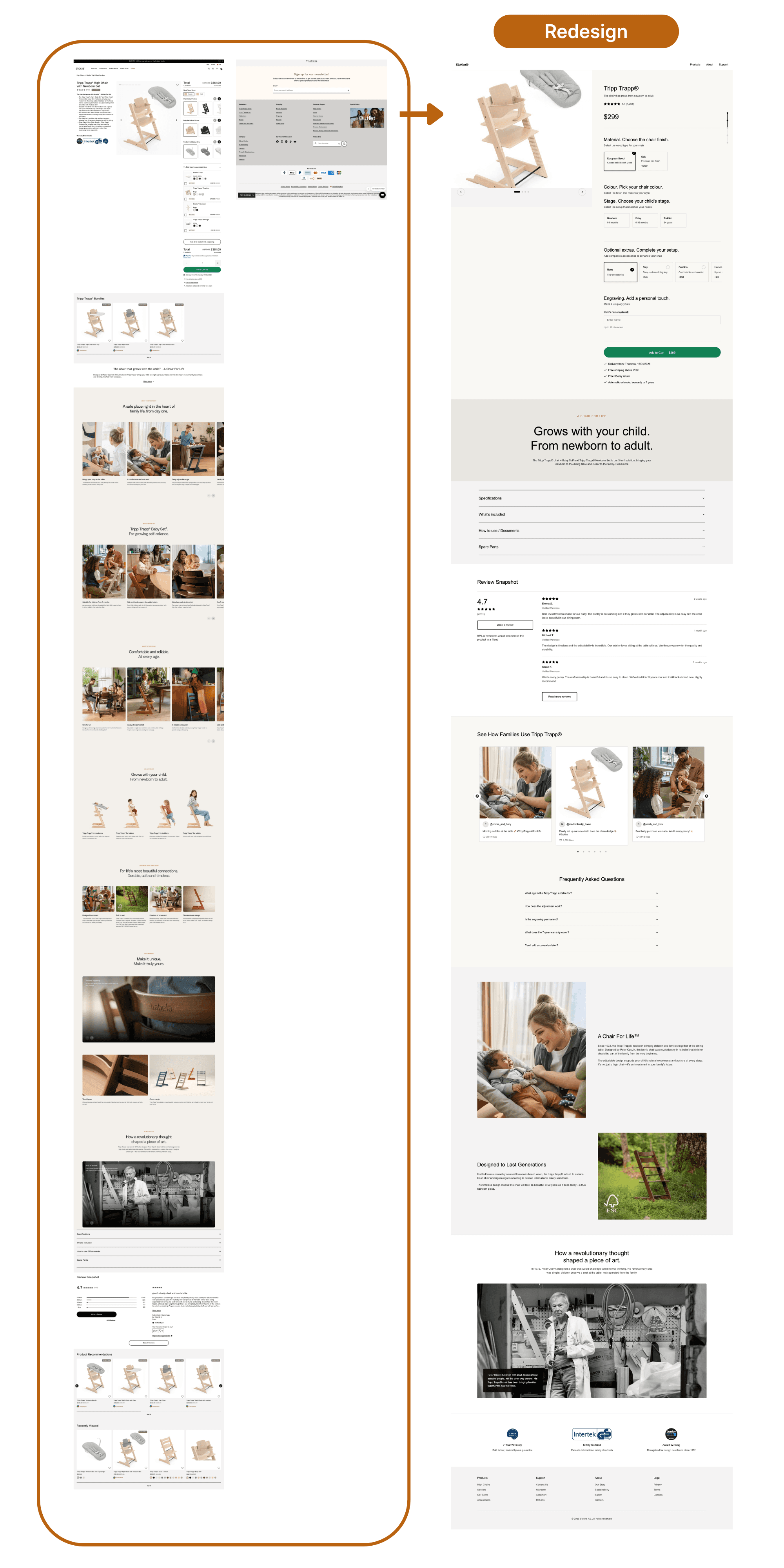
Design Response 2: Guided PDP / Product Builder
(Prototype link here)
The PDP becomes the main decision and purchase page.
Instead of sending users into separate SKU pages, the stage-led entries route into the same guided builder in a more relevant preselected state. For example, if a user starts from a baby context, the builder opens with that context already reflected. This means users do not have to restart the decision process from zero.
The builder follows a more natural sequence:
First, users choose the core chair setup.
Then they move into stage-driven required choices.
Then they can personalise the product.
Only after that do they see optional extras.
This guided flow reduces decision noise. Once a user chooses a stage, the page stops asking them to think about options that are no longer relevant. If they choose Baby, they do not need to think about Newborn Set options. If they choose Toddler, the flow becomes simpler again.
The commercial state is also more stable. Product title, current price, selected state, and purchase action remain clearer throughout the flow, helping users understand what they are building and what it currently costs.
Brand and product storytelling remain part of the page, but they support the buying flow rather than interrupting it.
Prototype Outcome
The final concept includes two connected redesigns:
Supporting product-family page: A lighter page focused on discovery, orientation, life-stage logic, and routing.
Guided PDP / builder: A consolidated purchase environment that brings selection, configuration, price clarity, and Add to Cart readiness into one flow.
The strongest change is not visual styling alone. It is the clearer separation of page roles:
The supporting page helps users learn.
The PDP / builder helps users buy.
This makes the journey feel more focused from discovery into conversion.
Trade-offs & Risks
This direction comes with trade-offs.
The product-family page becomes lighter and more focused, which helps progression but means some explanatory work needs to move either earlier into orientation or later into the PDP itself.
The PDP also takes on more responsibility. It is no longer just a detail page. It becomes the main decision and purchase environment, so it must support both clarity and action.
There are also supporting issues that should be addressed in a real project. Navigation clarity matters, especially for users who are not already familiar with Tripp Trapp. In testing, some users could find Tripp Trapp in navigation but hesitated because they were not sure which option to choose next. This suggests that navigation should not only expose the product, but also help users enter the right path confidently.
Some PDP states also appeared more purchase-ready than others. This affects conversion momentum and would require further investigation with internal data.
Next Validation Steps
If this were taken forward as a real project, I would validate three things:
whether the simplified route improves progression into the builder
whether the builder improves setup completion and purchase confidence
whether the lighter supporting page still gives enough orientation for users earlier in the decision process
I would also want to compare the proposed journey across desktop and mobile. The prototype focuses on desktop to show the builder logic clearly, but the underlying flow should work across devices. On mobile, the same logic would need to become a more vertical, step-by-step experience.
Outcome & Learnings
This project reinforced the importance of looking beyond individual pages and asking what role each page plays in the journey.
The biggest opportunity was not simply to improve one page in isolation. It was to simplify the journey architecture and make it clearer which page helps users learn, and which page helps them buy.
It also highlighted a useful product discovery principle: discovery is not just about making a product visible. It is about helping users recognise the right path quickly enough that they can move forward without unnecessary interpretation.
Final Thoughts
This concept is not a finished business recommendation, because I did not have access to Stokke’s internal analytics, device data, revenue contribution by accessory, or actual funnel performance.
But as a UX case, it shows how research signals, expert review, and competitive benchmarking can be used to move from page-level observations to a clearer journey strategy.
For Tripp Trapp, the opportunity is to preserve the strength of the brand story while making the route from discovery to purchase feel simpler, clearer, and more decisive.

